where clarity dissolves
& silence fades?
& silence fades?
Shum
&Mut
&Mut


A British Higher School of Art & Design project where illustrators & graphic designers split into 5 teams to design, produce, promote & document their collaborative publication.
Looking through grain of noise and murky glass. A book by 18 artists that explores these distortions through abstraction and storytelling.

Hover to see description
SEARCHING FOR AN IDEA

steam locomotives
in the metro
in the metro
Instead of a regular subway train, a pre-revolutionary steam locomotive pulls up to the platform. Where does it take you?
pills
Each day, a person takes a new pill from the set—and whatever happens, happens. Everyone invents their own side effect or consequence.
roman empire
Everyone finds their own "Roman Empire" and depicts it in their own unique style and form.
construction workers
behind the window
behind the window
Workers from the window. The ones we see every day. Each page captures one of their days, where absolutely anything can happen. For example: a page showing their usual dull workday suddenly interrupted by a tsunami.
fishes
What is a fish to you? An existential question that has haunted artists for centuries—from the scaly, hairy fish of medieval manuscripts to the three-eyed mutant fish of sci-fi and the conceptual "text-fish" of today. A fish isn't something objective; it's each person's own vision of what a "fish" truly is.
the book of
favorites
favorites
Each person selects 2-4 favorite things (exact number can be agreed upon) e.g., an article of clothing, a place, an emotion, a song, a food and represents them visually on a spread. The only rule: all items must belong to different categories.
invisible / hidden
Visualizing the invisible: emotions, scents, memories, rhythms, expectations. Everyone does so in their own style, without limits.
noise & murk
Each student is invited to find their own visual
interpretation of these words - literal or
metaphorical, abstract or concrete.
CONTENT

NOT MUCH TO SEE HERE...
Anastasia Ryzhenko
illustrator
2D concept artist

Elina Khashba
graphic designer
Nicole Bauge
graphic designer
Sofia Irimova
illustrator
visual designer

EDITORIAL TEAM
2D concept artist
illustrator
Anastasia Ryzhenko
graphic designer
Elina Khashba
graphic designer
Nicole Bauge
visual designer
illustrator
Sofia Irimova
EDITORIAL TEAM
Noise & Murk are two states where clarity dissolves and silence fades away. They might evoke emotions, visuals, physical sensations, or something entirely abstract. Each of us brings our own understanding to the words шум and муть. Each student is invited to find their own visual interpretation of these words — literal or metaphorical, abstract or concrete. The result will be a zine/publication in which a diversity of perspectives and approaches merge into a unified field of associations.
Questions: — What do I feel when I encounter these phenomena? — If these phenomena could speak, what stories would they share? (humanization) — In what ways do they reflect me? — What happens when vision becomes blurred and sound turns noisy?
Questions: — What do I feel when I encounter these phenomena? — If these phenomena could speak, what stories would they share? (humanization) — In what ways do they reflect me? — What happens when vision becomes blurred and sound turns noisy?
BRIEF
INSPIRATIONS

Created as part of ‘Ruins, Spats’ at Turf Projects in Croydon during the Fungus Press residency, ‘Please Accept This Catalogue For Your Shelves’ gathers personal yet curated images from the library — a place of many voices and worlds, quietly changing as ownership and governance shift.
by Neil Bickerton, Jessica Higgins, Hannah James, Matthrew Walkerdine and Rebecca Wilcox
Please Accept This Catalogue For Your Shelves
Editorial Design: GPJ XP
by Thomas Roux
Corporate editorial project created for George P. Johnson Experience Marketing, San Francisco, California. Bridging print and digital, this bilingual publication invites readers to explore in two ways — through traditional reading or by scanning images to unlock layered content: maps, sound recordings, and precise data. A hybrid experience where design becomes both tactile and interactive, connecting physical presence with digital depth
Ryoji Ikeda
Ryoji Ikeda is a Japanese artist and composer known for transforming data, light, and sound into immersive audiovisual experiences. His largescale installations, such as test pattern and data-verse, turn scientific information — from DNA to cosmic coordinates — into rhythmic visual symphonies. Drawing on his background in Tokyo’s underground music scene and his collaborations with institutions like CERN, Ikeda explores the boundaries between art, mathematics, and perception.
Rosa Menkman
Rosa Menkman is an audio-visual artist and theorist best known for her work with glitch art — the aesthetic of digital error and noise. She explores how technological malfunctions and data distortions can reveal hidden systems of control, communication, and meaning.
In her Glitch Studies Manifesto, Menkman describes noise not as destruction, but as a generative force that exposes the politics of digital media and opens space for new interpretations.
In her Glitch Studies Manifesto, Menkman describes noise not as destruction, but as a generative force that exposes the politics of digital media and opens space for new interpretations.
Stripsody
by Cathy Berberian
Created in 1966, Cathy Berberian’s Stripsody is a playful graphic score exploring the expressive power of the human voice. Using onomatopoeic sounds inspired by comic strips, the piece turns the performer into a one-person sound machine — producing every effect, gesture, and rhythm vocally.

Revue Maison
by Marion Denoual
After the first lockdown, designer Marion Denoual began rethinking what “home” really means. She invited artists, designers and writers to explore the idea freely, creating a “non-exhaustive catalogue” of what a home could be. The result was Revue Maison, launched in 2021 — a collection of personal reflections from within and beyond four walls. Now, four issues later, Marion continues to ask the same questions, capturing how our sense of home keeps evolving.


SCHEDULE
10
10
10
EDITORIAL TEAM PRESENTS THE PROJECT BRIEF
+ LAYOUT PRESENTS BOOK FORMATS
+ TYPOGRAPHY COLLAGING WORKSHOP
+ LAYOUT PRESENTS BOOK FORMATS
+ TYPOGRAPHY COLLAGING WORKSHOP
02
12
12
PRESENTATION EVENT
AT POWERHOUSE
AT POWERHOUSE
19
11
11
VOTE ON THE
PACKAGING DESIGN
PACKAGING DESIGN
11
11
11
PRINTING TEAM STARTS
WORKING ON RISO
WORKING ON RISO
03
11
11
INDIVIDUAL CONTRIBUTION
SUBMISSION DEADLINE
SUBMISSION DEADLINE
24
10
10
LAYOUT TEAM SUBMITS
A GUIDEBOOK
A GUIDEBOOK
21
10
10
LAYOUT & PRINTING TEAMS
PROVIDE THE WORKING FILE
FOR CONTRIBUTIONS
PROVIDE THE WORKING FILE
FOR CONTRIBUTIONS
03
10
10
TEAM DISTRIBUTION
THEME BRAINSTORM
THEME BRAINSTORM
20
10
10
DECDIDED ON PUBLICATION NAME,
PRINTING/BINDING METHOD,BOOK FORMAT
CREATED OFICIAL INSTAGRAM PAGE
PRINTING/BINDING METHOD,BOOK FORMAT
CREATED OFICIAL INSTAGRAM PAGE
24
11
11
CRIT
PRESENTATION
PRESENTATION
13
11
11
TELEGRAM CHANNEL
IS CREATED
IS CREATED
04
11
11
VOTE ON THE
COVER DESIGN
COVER DESIGN
29
10
10
VOTE ON THE
EVENT LOCATION
EVENT LOCATION
23
10
10
VOTE ON THE ZINE
VISUAL STYLE
VISUAL STYLE
17
10
10
DUMMY-MAKING
SESSION
SESSION
07
10
10
DETERMINING THE
FINAL THEME
FINAL THEME
29
09
09
START OF THE PROJECT
INITIAL BRAINSTORM
INITIAL BRAINSTORM
Sonya Persikova
illustrator
beginner animator
funny gal
Misha Mizutin
graphic designer
Vasilisa Lesnikova
graphic designer
LAYOUT TEAM
funny gal
beginner animator
illustrator
Sonya Persikova
graphic designer
Misha Mizutin
graphic designer
Vasilisa Lesnikova
LAYOUT TEAM
BOOK FORMAT OPTIONS
chosen option
- All works in one big format
- Smaller format acts as a divider
- Possible to have to separate pages or add a spread
2 PAPER FORMATS
PER PARTICIPANT
PER PARTICIPANT
HALVES
- Format A4
- Binding spiral coil / rings
- Sheet is divided in half and cut
- Effect of combining works from different students
NEWSPAPER
- Newsprint paper
- Format bigger than A4
- Possibly multiple printing techniques
- Ribbon-bound
- Can be rolled in for presentation
4 PAPER FORMATS
PER PARTICIPANT
PER PARTICIPANT
- Min & max pages sizes are selected + 2 inbetweens
- Each participant does at least 1 page in max size + an additional smaller option
SAFE OPTION
- Block division
- Work in terms of spreads
- Possible to use tracing paper
CHAOTIC DIARY
- Fixed max format A4
- Consists of different formats
- Binding options: rings / coil / self-binder
- Stylized as a folder with possible inserts

Zhenich

Stanisław
Сactus
Сactus

Vasiliy

einar

sam

Ignatiy

Nurbek

Tom
Anastazja

Arman
cactus
cactus

Cactus

Galya

DUMMIES

Click on a dummy on the picture to see a close up

Zhenich
Stanisław
Сactus
Сactus
Vasiliy
einar
sam
Ignatiy
Nurbek
Tom
Anastazja
Arman
cactus
cactus
Cactus
Galya
DUMMIES
Click on a dummy on the picture to see a close up
FINAL BOOK STRUCTURE
student
work 1
work 1
divider
student
work 2
work 2
<-
->
Feature Mono is a monospaced typeface inspired by 1960s computer fonts, updated to meet today’s design standards. It was chosen to highlight the book’s modern feel and clear, structured layout. The font brings a steady, rhythmic quality to the typography and creates a striking contrast with the students’ work.
Pack my box with five dozen liquor jugs
В чащах юга жил бы цитрус?
Да, но фальшивый экземпляр!
Да, но фальшивый экземпляр!
123456789 /*-+()[]{}< >?!@№#%^&””:;
CC Free use with attribution
FONT
The logo needed to strike a balance between expressiveness and neutrality—reflecting the zine’s concept while staying flexible enough for twenty contributors with diverse visual styles. A subtle texture of noise and soft blur was applied to the logotype, adding character and directly echoing the zine’s themes of visual ambiguity, layering, and controlled chaos.
LOGO
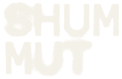
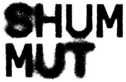
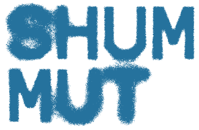
The same subtle effect—soft blur and grainy texture—was applied to all typography in the zine to visually echo its core theme: noise and haze. This treatment gives the type a distinctive character and cohesion, reinforcing the zine’s concept of visual instability while making it instantly recognizable.
CREATING THE NOISY
MURKY EFFECT IN
MURKY EFFECT IN

Anastasia Ivanova
printmaker
comic artist
vivid picture-maker
Polina Bogdanova
illustrator
craftswoman
comic artist
Maria Marchenkova
illustrator

PRODUCTION TEAM
vivid picture-maker
comic artist
printmaker
Anastasia Ivanova
comic artist
craftswoman
illustrator
Polina Bogdanova
illustrator
Maria Marchenkova
PRODUCTION TEAM
PRINTING METHOD
Risograph printing works by creating film stencils (masters) and applying colors through them one at a time. Since it prints with dots, and two layers of colors have to be matched manually, the outcome looks quite noisy and distorted matching our theme.
PAPER
We ended up using SL Graphica Natural White, since it has a pleasant natural hint of beige, it is slightly rough to the touch and has proved to absorb riso inks well. Colorlab F15, the blue paper, has similar features and matches the main block.



10
11
11
PREPARING FINAL
LAYOUT FOR PRINTING
LAYOUT FOR PRINTING
18
11
11
LAYOUT TEAM AND PARTICIPANTS
SUBMITED REVISED WORKS
SUBMITED REVISED WORKS
01
12
12
PACKAGING ALL
THE BOOKS
THE BOOKS
27
11
11
STARTED CUTTING,
HOLE-PUNCHING,
CREASING,ASSEMBLING
HOLE-PUNCHING,
CREASING,ASSEMBLING
25
11
11
DIVIDERS AND
COVER PRINTED
COVER PRINTED
21
11
11
PRINTING BLUE
LAYERS
LAYERS
18
11
11
PRINTED 18 BLACK
MASTER FILMS
(ALL WHITE PAGES BOTH SIDES)
MASTER FILMS
(ALL WHITE PAGES BOTH SIDES)
13
11
11
PRINTED 9 BLACK
MASTER FILMS
MADE A DIGITAL MOCK UP
MASTER FILMS
MADE A DIGITAL MOCK UP
28
11
11
ALL BOOKS
FINISHED
FINISHED
26
11
11
PRE-CUT THE PAGES
ALL SIGNATURES SORTED
ALL SIGNATURES SORTED
24
11
11
FINISHED PRINTING
THE BLUE LAYERS
THE BLUE LAYERS
20
11
11
BLUE PAPER
ARRIVED
ARRIVED
14
11
11
GAVE MARGIN REVISIONS
TO THE LAYOUT TEAM
TO THE LAYOUT TEAM
11
11
11
PRINTING SMALL TESTS
DETERMINING FILL CONTRAST
DETERMINING FILL CONTRAST
PRINTING SCHEDULE
Alex Nitochkina
graphic designer
mixed-media artist
Marianna Uruskina
graphic designer
web designer
3D / motion designer
Aleksandra
Koldobenkova
Koldobenkova
graphic designer
Anastasia Bychkova
graphic designer
mixed-media artist
Anna Chaschina
graphic designer
mixed-media artist

PR TEAM
mixed-media artist
graphic designer
Alex Nitochkina
3D / motion designer
web designer
graphic designer
Marianna Uruskina
graphic designer
Aleksandra
Koldobenkova
Koldobenkova
mixed-media artist
graphic designer
Anastasia Bychkova
mixed-media artist
graphic designer
Anna Chaschina
PR TEAM
You can see our process through
the lens of the PR team by visiting
our INSTAGRAM and TELEGRAM pages. They also provide further explorations on the topic of noise & murk.
the lens of the PR team by visiting
our INSTAGRAM and TELEGRAM pages. They also provide further explorations on the topic of noise & murk.
PRESENTATION EVENT LOCATION
join us on December 2 2025
19:00
Powerhouse
Goncharnaya Street, 7/4
19:00
Powerhouse
Goncharnaya Street, 7/4
Daria Mishina
graphic designer
illustrator
Daria Kochevalina
illustrator
Nikita Semerenko
graphic designer
illustrator
type designer


DOCUMENTATION TEAM
illustrator
graphic designer
Daria Mishina
illustrator
Daria Kochevalina
type designer
illustrator
graphic designer
Nikita Semerenko
DOCUMENTATION TEAM
During the development of these icons, my goal was to create simple and easily recognizable visual solutions. Each icon reflects a key aspect of its process. For instance, the editorial team’s process of exploring different options or the layout team’s task of arranging elements on pages. It was essential to maintain consistency with the overall website style: angular and not overly detailed, to not draw excessive attention away from the content.
ICON DESIGNS
by Dasha Kochevalina























During the development of these icons, my goal was to create simple and easily recognizable visual solutions. Each icon reflects a key aspect of its process. For instance, the editorial team’s process of exploring different options or the layout team’s task of arranging elements on pages. It was essential to maintain consistency with the overall website style: angular and not overly detailed, to not draw excessive attention away from the content.
ICON DESIGNS
by Dasha Kochevalina
by Dasha Mishina
WE DID A FEW OPTIONS FOR PHOTOS...


For photo processing, we chose a style that mimics printing on a risograph. To do this, we ended up converting all the images to duatone mode using blue and white colours, and added noise on top of the photos, which creates an uneven texture, as when printing. Thus, all the photos on the site support the style of our zine.
Vlad "Автор"
пишешь треки?
нужна облога?
Kameeelah Mamedova
Sputnikat Publishing
BA Illustration Tutor
Stepan Lipatov
BA Graphic Design
Course Leader
Course Leader
Laetitia Martinez
BA Illustration
Course Leader
Course Leader

CURATORS
